Logo Design
MentalRights.com
Exploring the process of making a logo for the mental health rights awareness non-profit organization.
01.
Plan & Sketch
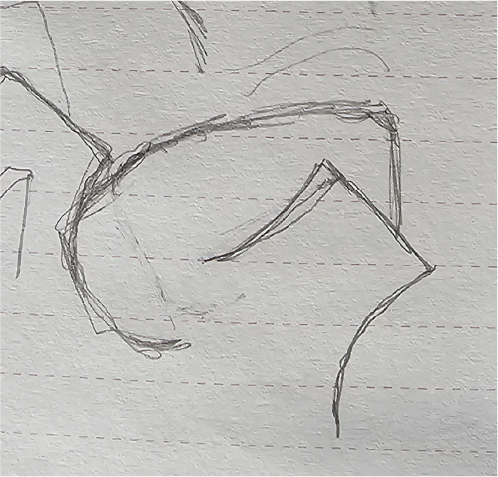
First thoughts were to combine fist and brain. Fist, to represent rights, and brain to represent the mind for “mental.” Making the fist associated with the brain cavity, replacing the brain to combine the words “mental” and “rights.”


02.
Chosen Piece
The client wanted a simple design that can be identifiable to the brand when seen. Because of this, the sketches simplified over time to find the basic shapes for a rememberal design. This sketch was chosen by the client.
03.
Digital Refinement
In the digital refinement, I can see the details of the sketch vanish. There is something too different that changes the shape. I would like the pinky area of the hand to have more spacing and a less round look. There is a “P” in the fist that has no correlation to the non-profit name.

04.
Choosing Type Face
The goal for the type face was to find an official, documentation style to give an important presence, while also having softness and roundness for understanding and comfort. Mental rights can be a serious topic and I wanted to match that energy.


Source Serif
Results
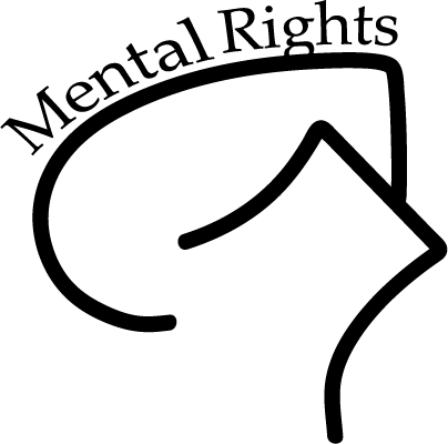
Final Result
The client plans to put this design onto garments to raise funds for the non-profit. The client seemed pleased with how the loogo turned out.
Testmonial
“I like this one. The bolder one.“
-Yvette, Mental Rights CEO
Get In Touch
Let’s Work Together!
chelseafrederickswork@gmail.com